Sunday, February 27, 2011

Brilliant Design or Great Marketing?

{Before I get to the heart of my question, let me say this...I am in awe of established designers not only for their talent, but for their necessary tenacity to get where they are.  As in most careers, not any easy thing, garnering acclaim.  So, that's my disclaimer before I start.  Those I refer to in this post are brilliant, and I pose my question as something to ponder, not as a judgement on the execution of their aesthetics.}


What's the question?  When a top designer hones his or her "look", is conscious thought given to the palettes used, based on how they will photograph?  (I hear you gasping at the suggestion.) 


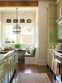
Jackye Lanham via Cote de Texas


This thought came to my mind the other day when I read two posts on two different blogs, visually devouring the images as I read.  Later in the day, I thought "I wish the colors in my house were all light neutrals -- they'd be so much easier to photograph."   Light bulb!  Have those who have reached stellar success consciously made the decision to use light colors and shades of white to make the most of their portfolio images?  It is an indisputable fact that whites and lights look stunning in photographs.  If so, I say, "Bravo!", brilliant and talented marketing at its best, equal to the talent of said designers (if they do in fact, exist!).   After all, portfolios are a vital part of the business of design, yes?


Jackye Lanham, via Cote de Texas


The above images are from the fabulous Cote De Texas blog, where Joni recently highlighted the ultra beautiful work of Jackye Lanham.   I'm sure you've already seen them, but look again with a different eye (these rooms are the epitome of gorgeous to me).  Much of Ms. Lanham's work is done in neutrals.  Is that an intentional part of her look for the purpose of her marketing?

Now let's look at a fantastic post done by Maria Killam at Colour Me Happy on the topic of the great Vincente Wolf.  In her post, she tells us that Wolf only uses Ben Moore's Super White in his work.  Is that for brilliant photography or because he truly believes it is the best possible design choice?  Here are a couple of photos I borrowed from Maria...


Vincente Wolf via Colour Me Happy


Vincente Wolf via Colour Me Happy

Vincente Wolf is a brilliant designer, as is Daryl Carter and my personal favorite, Phoebe Howard. They both do a ton of neutrals and lights, too.  I could name others, but you get the point.

Again I go back to my opening statement for this post.  I am not suggesting manipulation for fame or insincerity in design.  Hardly.  I am simply continually fascinated by every aspect of design, even the mind of the designers themselves.  In an endless effort to improve my own skill, as so many of us do, I look to icons for inspiration and lessons.  Where is there more to learn, I ask.  So when I read both Joni and Maria's posts in the same day and the thought came to me, I had to share it.  And, as I said and we all know, design is indeed a business.  Brilliant marketing helps.

Perhaps designers who read this post will think I'm nuts.  But, who knows?  It's interesting to contemplate, isn't it?  If you're establishing a look for yourself (aside from the fact that you are passionate about it), would you use only certain colors because they photograph well? (And don't do the immediate "of course not!" and huff off -- think about it...)

Talk to you soon,
Carol


Friday, February 18, 2011

Before and After: Kids Bathroom on a Budget

Meet "The Clients"...

Ages 10 and 13

The Mission:
Take their bathroom from ho-hum to happy for under $200.

Given that just about everything in this bathroom was staying put, this project became all about style and color.   I say, embrace what you can't change.  This floor?  We had to make peace and carry on.


Before...
gray, dark, and no fun to brush your teeth in.


After...
happy enough to maybe even get the girls to want to clean it (every mother's hope).


Here's the color pallet...


Why these colors? (The red dot is actually very deep cranberry like the floor).  Go back and look at that floor.  That's a lot of deep burgundy with gray grout, isn't it?  It sports a lot of muscle in that cozy room, and the wall color had to be something strong enough to push against it, and make it play nice.  So, looking at my inspiration Wall Pops (again, strong and vibrant),  I chose Wales Green from Ben Moore, and had it made up at 75% strength.  In this particular space, 75% gives the appearance of the color at full strength.  We now had walls and a floor that talked to each other in a happy tone :).


Here are more before and afters...

This wash stand came out and the laundry hamper took its place on this wall. (Function is a necessity after all.)


What you can't really see in this picture is that the white towels are a plush chevron pattern to pick up on the laundry hamper (again, embrace, embrace).


A white dresser from a spare room came in for storage, and there is actually a fish tank to the left.  The artwork was created and framed by the younger of the two girls.  It was casually left on this chest in the hopes that Auntie (that's who I am to these girls) might want to use it.  Of course, it had to take center stage!  The scale is on the floor on the right.


The vanity needed a little sprucing up.  (Here's a trick for cutting crisp edges -- use a quilter's circular scissor, transparent ruler and cutting mat.  Works great on wallpaper, too.)


While the budget didn't allow for new lighting or a different mirror, Matt, The Dad, (who also did the painting lickety split) recessed the existing medicine cabinet and moved the lighting so that both were aligned.  Check it out...


And that's the end of our story!  Mission accomplished.


 Life is swell, isn't it?

These girls are the kids of my friend-since-I-was-5 Ginny, and our kids are growing up very close (very cool -- it's like watching ourselves grow up all over again!)  When Ginny asked if I wanted to do their bathroom for the blog, well, how could I say no to that?  :)

Talk to you soon,
Carol

PS  Lesson learned on this one -- bathrooms can be ridiculously hard to photograph so that you get a true sense of the entire space.  Just saying.

Thursday, February 17, 2011

I've Been Invaded by Scots

You know I like to find some kind of meaningful connection to the things I put on my walls.  So when I saw these prints of Scottish soldiers in my favorite consignment shop, I knew they had to be mine.  Perfect addition to my family room (my man and I both have some Scottish blood, and our good friends live there).

When I got them home, I placed them on the floor to decide on a layout.  This image was taken on the rug in my family room ( I wish it was my wallpaper).  It's a wool tweed with a leather boarder and I love it.  I digress.  Here they are...


I'm crazy about them, but the bright brass toned frames were a bit much, so I picked up some black water-based stain and gave them a makeover...


And here they are, on the wall...


That wraps up my day!  How was yours?

Talk to you soon,
Carol

Monday, February 14, 2011

Going (The Color) Green

I looked around my house the other day and said to myself, enough already with the green.  I love green.  Ever since my very first apartment 23 years ago (ouch) I have decorated with green.   Every room, in every place, at some point was done at least in part, in green.  Pea to perfect sage.  I've had it. (I mean I've had every shade, not that I'm done with it.  Oh contraire.)

In my current home, green tells it's story in every room on the first floor. Well, it's a somewhat open colonial, and I like flow, so there you go.  Anyway, tonight in the market I picked up Coastal Living's Style Guide and found me some green love on this Valentine's Day.  Thought I'd share some inspiring photos (all are Coastal Living unless otherwise stated).

Can you even stand how gorgeous these drapes are???


photo credit: J. Savage Gibson


I have fallen in love of late with blue green (another color I've always used) and yellow green together...

photo: photo: Deborah W Liewelleyn


I'm less of a clear, clean green person and more of a muted, earthy green gal, but this chest makes me smile...

photo: Deborah W Liewelleyn


To die for Romans...

photo credit: David Tsay


Painted green floors?  Heaven, my friends, heaven...

photo: J. Savage Gibson


photo: Tria Giovan


 The green on these cabinets is me, look up green in the dictionary, and there's my face next to this shade...

photo: Deborah W Liewelleyn


photo: Richard Leo Johnson


Love the olive green ottomans and the blue green chair.  I'm having coffee here...

Southern Living Tria Giovan


photo: Tria Giovan


A traditional green kitchen.  Hi, my name is Carol and I'm addicted to green.

Southern Living: Lori W Glenn


I can't be the only one who repeats a color in varying shades, year after decorating year.  What's your number one standby?

Talk to you soon,
Carol

Sunday, February 13, 2011

Finally Found My Fab

When it comes to making decisions for my own house, be it fabric, paint or furnishings, I take for.ev.er. to decide on anything.  My clients, however, get my absolute decisions in no time.  Very frustrating for me, let me tell you.  It's no wonder people hire designers.

But, alas, I have found love this Valentines Day eve with a fabric I ordered for my family room drapes today.  I had already picked up on clearance this equestrian fabric which I have been hyperventilating over since I bought it a few weeks ago.  In search of the perfect leading edge contrast, today I came upon this tiny green and brown hounds tooth check.  Heaven sang to me when I added in this trim, which will run the length of the drapes between the two fabrics.


To give you a sense of what my design will be, albeit the colors are way off (my walls are BM Wethersfield Moss, not limey like my picture), I drew this to share...


A tad elementary, I know, but hopefully you get the idea.  I wish my room were as bright and happy as this, but in fact, much to our utter dismay, this is a dark room.  So, I've tried to embrace the "atmosphere" (lol to call it that) and go for a look that is sort of English library.  You may recall from an earlier post that this find hangs in this room, too.


When miracles happen and I have some free time, I'll be putting these drapes together. I can't wait to get them up.  (By the way, I've had some readers ask if I sew for clients -- I did years ago, but I only design them now, except when my arm is twisted by a good friend).

What Fab thing have you found for your house lately?

Talk to you soon,
Carol

Friday, February 11, 2011

Before and After: Dining Room Done!

I was sad to see it end, this project that has taken soooo looonnnngggg.  (I think I may have dragged it out a little as we were having  too much fun.) But, I'm thrilled as all get-out to show you the final before and afters!  Be prepared, this is a long post of pictures :)

When Glen, my friend of a gazillion years, and his fantastic partner, Mario, asked me to help with their dining room, I knew I was in for a treat.  These guys have great taste.  Their home is a small ranch that's big on style.  Modern Masculine is what I'd call it.  Anyway, who could resist helping these two?


Glen Badessa, President and CEO of his company Immortal Cosmetics, 
and Mario Hilario, NBC News Anchor, Providence, RI.


When Glen and I got together to develop a plan for the space, he told me he was inspired by the modern, clean and graphic lines of Villa One Twenty, a Bed & Breakfast in Newport, RI.  You can see pictures of it in my post here .  He wanted black, white and taupe, something strong.  The budget allowed for everything but a new chandelier or dining table.  The black roman shades were staying, too.  Yippee!!  Lots to do!

After  too-many-to-count cheek-aching laughs and several consults, shopping trips and working sessions later, here are the before and after shots.


So, that's how it all turned out.  I'd still like to style the table (a white faux fur runner is on my mind), and some artwork is coming to one wall, but other than that, there she is.  Working with Glen was a great collaboration, and Mario was our best supporter.  Nothing beats working with someone who's on the same page and totally "gets" it.

For those of you who are new to Sofas & Sage, (who are you and where have you been?), I'm glad you're here for the final reveal.  If you want to catch up on this saga, you can read about it here and here, too.

Thanks, Glen and Mario, for letting me wedge my foot in your decorating door and stay a while.  What are we doing next? :)

In an upcoming post, I'll show you a bit of the work that went into the drapes, paint, and corner cabinets,

Talk to you soon,
Carol