Showing posts with label Accessories. Show all posts

Tuesday, August 14, 2012

John Derian's Fantastic Plates and So Much More

from John Derian.com

 Does everyone know about John Derian, and I'm just late to the party?  I discovered his brilliant decoupage work this summer, in one of my favorite shops, Cottage and Garden, in Newport, RI. 


John Derian at Neiman Marcus

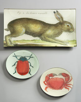
I picked up a gorgeous plate, similar to this one with the rabbit, and I fell in love.  With the plate. Okay, and then everything about the guy when I checked out JohnDerian.com.  

John is a decoupage master.  His isn't the stuff of a kitchen-table craft project.  Every glass plate he creates is art.  He works out of his studio in New York City, and has a store in the East Village.  If you check out his website, you'll see his work is carried in shops everywhere.  Who knew.

I took a few images from his site to show you, but don't be fooled by the ones I chose -- his subject matter is highly varied.


You really have to check out his collection.  On line, he also shows his additional offerings...


Furniture he designs...

Heaven help me, I want these pieces in my home.

Vintage lighting...

Linens...


Who wants to visit his store in the East Village with me?  Uh huh.  Knew you'd like him :)

By the way, I don't know John Derian, and I've got zero personal connection to his stuff, other than I wanted to share it because I found his plates, in person, to be gorgeous.

Hope you have a fabulous day!
Carol

Friday, March 4, 2011

I Got A New Rack

Put your eyebrows down.  Plastic surgery isn't the topic today.  I'm talking antlers.  Deer antlers.

If you read design blogs or the latest magazines on hot decor, you'd have to be sleeping through it to not to notice all the antlers being used in design of late.  They are everywhere, from white plastic deer heads to silver coated Texas Long Horns.  Some of them are clever and whimsical.  And I have to say, unless you have a personal connection to them in some way, why would you use them for any other reason but whimsy?  The fake ones, I mean.

Here's a couple of examples, the first from Ballard Designs, the other source unknown...


(I found the above on Google images, which led to the blog  Chic on a Shoestring, which I immediately fell in love with.  Check it out.)


I won't bore you with the million images out there of rooms using them.  Instead, I will entertain you, lol, with this image from my family room.


The antlers, yes, are real, and they came from my parent's house, where my dad has several racks holding his collection of baseball hats and other sundries.  They line the stairs to the basement.  When I asked him if he'd like to donate some to my family room (in my ongoing attempt to have this room truly reflect our family), he offered me these.  I love them.  He had mounted them on a slab from a cedar tree.

So I have given in to trend and put antlers in my house.  Only because they reflect my dad, and my husband's one foray into deer hunting (another story).  They also contribute to the English library feeling I'm going for in there.  (Can't you just imagine the stenciled, tone on tone damask pattern that coming to those walls? :).

Do tell...are you in or out on antlers?

Talk to you soon,
Carol

Wednesday, October 13, 2010

Creating Interest at Different Levels

My client's family room is the perfect example of needing to decorate, accessorize, and add texture at different levels within one space.


Look at all the planes in this one room.  After the highest point was dressed with artwork that the client fell in love with (over an exceedingly high mantle), the windows in the room were all treated to great texture with woven-wood blinds.  At the next level -- the hearth.  Keeping accessories at eye level or below in any room  helps establish a relationship between furnishings, those accessories, and you.  It helps envelope you with atmosphere. 

Here, I rearranged her furniture so that her matching chairs flanked the fireplace.  Before, the very high hearth was empty, offering a cold, not-so-cozy feeling in front of the fire.  A beautiful chaise was to the left, and there was no chair to the right (they were flanking the entrance to the room, making it easy for your eye to miss them as you focused on...the focal wall!).


Now, by adding a mossy green velvet ottoman, a plant, some books and a candle stick at eye level (and easily accessible), the once empty and chilly hearth now feels like an active part of the space.  It serves as a table, inviting you to grace it with a cup of tea. 

Above each chair, on the side walls, are beautiful floral giclees.  Make sure to hang artwork low enough so that it maintains its relationship to the furnishings nearest it.  Too often, we see artwork floating out on a wall, lonely, desolate, not talking to anything around it.  It feels adrift, and that can end up being the feeling you get in the space -- unconnected.

While my client isn't fond of a lot of "stuff" on her surfaces, we did have fun gathering some items from around the house to style her new bookcase (with a remote lift-system tv hidden in the middle section!  Lucky girl!).  Here is a peak...


When you consider your own space, look at all the different levels, or planes, within it -- do they talk to each other and contribute to the atmosphere you're after?

Talk to you soon,
Carol

Tuesday, September 28, 2010

Clutter and Accessories Are Not the Same Thing

There are those of us who love "stuff" (accessories) in a room, and those who can't stand clutter.  But clutter and accessories are two very different things.  Clutter messes things up, detracts from the loveliness of a space, needs to be cleaned out (or thrown out!).  Accessories enhance a room's furnishings, lend personality, interest and even intrigue.

I came across the book cover below in my research for this post, and laughed out loud.  Ok, women out there, I think we all have to admit that this is funny...


In my mind, clutter comes in two forms -- visual and material.  Material clutter is just too much in a space, be it furniture, collections, kids toys, even stacks of bills (guilty of that!).   Most of us battle material clutter all the time.  But visual clutter, that's an entirely different beast, but it can be just as irritating.

Visual clutter is when there is just too much going on at once in a space -- your eye can't rest anywhere, and it can make you physically uncomfortable.  The picture below is an example.  The clients told me they wanted to redo the room because it wasn't relaxing.  They knew how they felt about being in the room, but they didn't know why or how to fix it.  This is visual clutter:


 The greatest offender is the window treatment.  Why?  The dark red against the pale wall is too high contrast, and, enough already with the too-short,  inverted roller coaster!  What you can't see from this photo, unfortunately, is that the wall on the left had a different ceiling height, a tall mantle, and built-in bookcases on one side of the fireplace that were yet another height.  When you were in the room, your mind could not focus, for all the distraction in horizontal lines.

I hesitated to show the in-progress after picture (because the photo quality is so poor, you cannot see all the detail in the fabrics, which look like they don't work together, and the client insisted on matching frames, which I did not suggest).  The drapery panels have a gorgeous tone-on-tone bamboo pattern, and the Asian-inspired benches in the back have the same blue-green as is in the sofa (no thanks to the flash), the rug, and the invisible (!) dot pattern on the chairs.  The sofa also got a big down pillow upholstered in a red chinoisere pattern with golds and blue-greens in it. To help with all the differing horizontal lines,  I had the window treatments hung at the same height as the bookcases across the room.

I hope you can see how the visual chaos/clutter is now disappearing...


On to accessories.  They come in many forms -- artwork, lighting, pillows, throws, vases, books, and on...  When carefully chosen, they simply look like things that are meant to be there, and they help tell the story of the room and the person who lives there. And, when artfully edited, never feel like clutter.

All of the following are from Elle Decor's LookBook.

Pay careful attention to how the sum of the parts makes the whole...if you took away the accessories, these rooms would loose their wow factor.


Michael S. Smith

Rose Ann de Pampelonne


Charlotte Moss

Elizabeth Martin


Martial

So, do tell...are you smothered by material or visual clutter?  Or do you have accessories that support your room and help tell your story?

Talk to you soon,
Carol

Sunday, September 12, 2010

Plants as Accessories

I love a home with plants and flowers-- real, silk, anything but dried.  They bring nature and life into a room in a way that other accessories cannot.  Many people are opposed to "fakes", but I say, if your green thumb is tarnished, why not us them?  No maintenance!

Here is a look at how to use plants, large and small, in ways that not only add an organic element to a room, but great texture as well.  And we all know that every room needs great texture.


Designer: Susan Zises Green, Traditional Home
Designer: Dan Carithers
Designer: ? Boszhardt
Designer: Meg Braff
Designer: Nancy Berger
Designer: Dan Carithers

Fill a nook, make a statement, set a mood -- all possible with plants.  Give it a try.  You won't be disappointed (and the satisfaction-to-budget-ratio can't be beat! :).

Talk to you soon,
Carol

Friday, September 10, 2010

Who's Using Zebra Rugs?

Zebras, it seems, are leading the herd right now when it comes to animal prints.  It's no wonder -- the zebra pattern has incredible graphic impact.  While the leopard print will always remain a favorite of mine, the zebra has undeniable appeal.

First, a look at a hallway that speaks softly of great style...See how subtle it is (and totally unexpected)?

Ralph Lauren
Now, let's go bold with the zebra...


Designer: Jonathan Adler

Don't you just want to follow these stairs and see what eye candy there is?  Such a bold use of color and pattern...

Designer:  Jonathan Berger

Zebra goes rustic....


Designer: Mimi McMakin

Here, the zebra is on a the sofa blanket while another animal friend warms the floor...


Designer: Ned Marshall

This rug is so unexpected in this warm and inviting library/living room, don't you think?


Designer: Susan Jamieson

Are you a zebra fan?


Talk to you soon,
Carol


Thursday, September 9, 2010

Pillow Talk

I broke one of my own rules today about blogging -- I was without my camera!  How unfortunate, as I had the opportunity to capture images of some gorgeous custom pillows, designed by my friend Joanna (who lent me her camera!!), for her pillow-novice client.

What's a "pillow-novice" you ask?  Simply put, someone who either doesn't understand the impact pillows can have on the overall design of a room, or, someone who just doesn't know how to pull a pillow look together.   Joanna's mantra "no room should be without fabulous pillows" is so true -- and rarely is there a client of hers that goes without!


What prompted this post, other than having just seen these little works of art, was wanting to show you how to artfully mix fabrics to achieve impact, while creating a somewhat  "unplanned" affect.  Coordinating fabrics for pillows (along with the rest of a space) is a talent, and I am always inspired by Joanna's ability to add the unexpected into her work.


Designer: Joanna Phillips


The inspiration for this fabric combination came in part from the artwork (a series of these more contemporary images), the golden beige of the sofa fabric, and the orange/pumpkin  paint color (a shade which relates to the orange-y color in the one "random" lumbar pillow in the mix.)  Looking at these pillows together, would you have done the one in the front?  My guess is, only a few of you would say you would have thought to add that!  And isn't it fabulous? 


Designer: Joanna Phillips

Overly coordinated fabrics, whether on pillows or in an entire room, usually border on boring.  I don't think any of us strive for a boring room!   So the next time you are looking to freshen things up a bit, take a lesson from Joanna -- look for an inspiring color in a room and pull it out in something unexpected.  A pillow, perhaps?

Talk to you soon,
Carol

Monday, August 30, 2010

Decorating with Plates

Using plates in the design of a room makes for fabulous "artwork."  You'll typically see plates used in Country French, English Country and Traditional styles of design.  Personally, I'm a big fan.  Here are some examples...

Designer: Bunny Williams
Don't you just love the rug, too, in this picture below...

Designer: Bunny Williams

Here's a more contemporary take on Traditional....

Designer: Celerie Kemble

Designer: Celerie Kemble
And then there is the king of French-inspired interiors...

Designer:  Charles Faudree

Designer: Charles Faudree
You'll also find plates used in various ways in country style, too...

Designer: Unknown,   Source: Country Home Magazine

Lastly, here a two images from House Beautiful...


This is by far my favorite of this series of images, below.  I love the blue and white against the stone wall.  Rustic meets refined.  It's so textural and beautiful!

Designer: Unknown, Source: House Beautiful

Do you have plates hanging anywhere in your house?  If so, what's your personal style, I'd love to know!

Talk to you soon,
Carol